
With LINE popular around the world, available in 19 languages, and offering so many different services, the product designers at LINE have necessarily had to design similar components repeatedly over the years, leading to the gradual accumulation of unnecessary legacies and communication redundancies. To solve these problems and get all the LINE designers in all our offices to agree on the same values and principles, we launched the LINE Design System.
We started this project with three goals: Efficiency, Good Design, and High Standards. These might seem like unassuming goals, but in fact they are very important, and both the LINE Design System team and local product designers worked together to get them right. We came up with the LINE Design Principles, which are the basis of LINE design, and created the LINE Design System, which consists of Foundation Guidelines, a Components Library, and UX Guidelines so designers can put these ideas directly into practice.
Finally, in November 2021, we introduced LINE Design System to the world.
LINE Design Principles
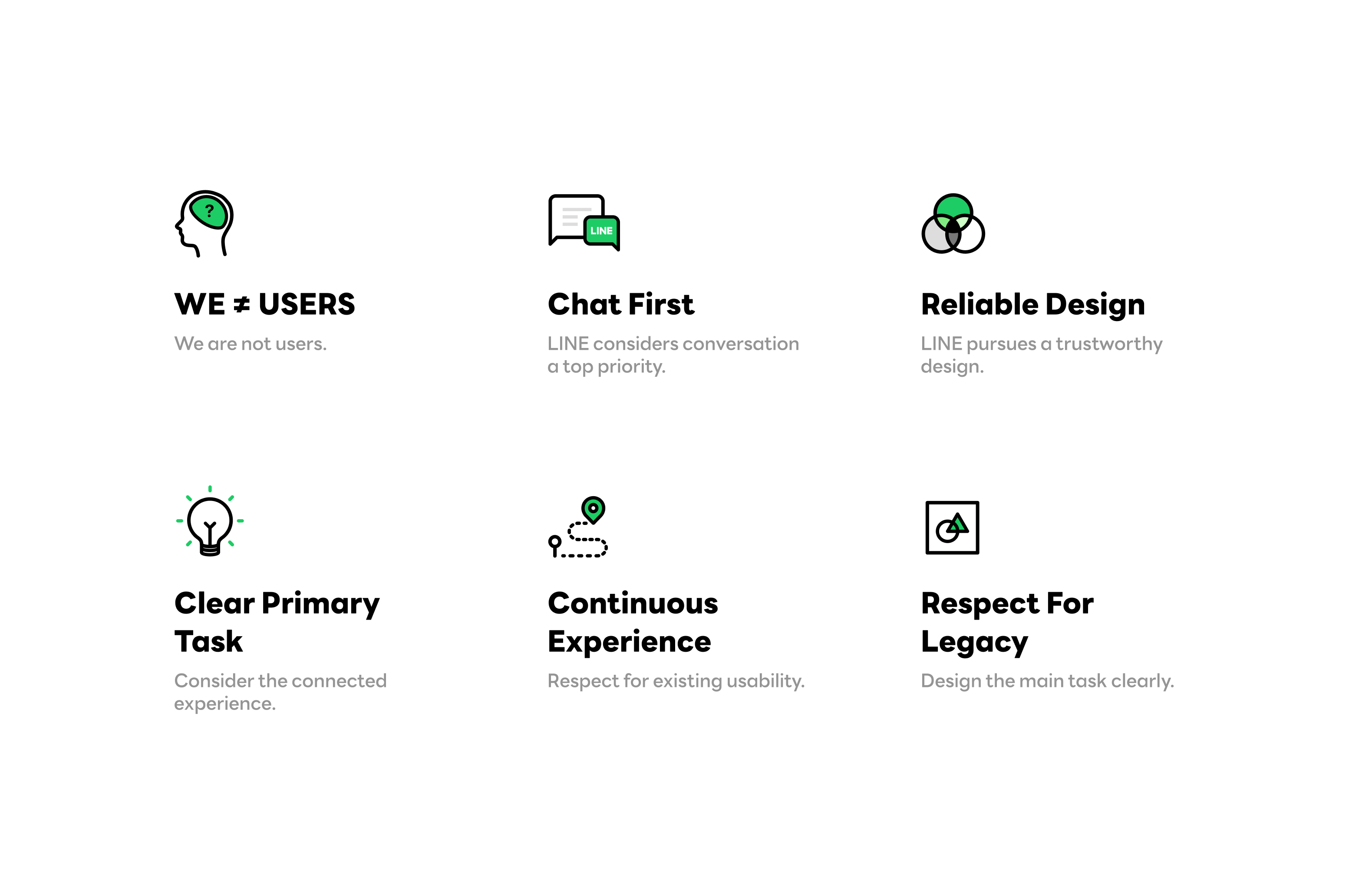
In order to ensure all our services at LINE use a unified design language, we created a set of mutual values and 6 principles that are the foundation of all LINE design.
The first principle, "We are not users," is important because it reminds product designers not to guess or make assumptions about what users want, and not to assume that, because a designer likes something, the users will want it, too. LINE's designers need to work on all sorts of different tasks and challenges, and regardless of the field — even if it is a field that they know well — they must make their decisions based on clear data.
In addition, as the LINE mission is "Closing the distance," we need to first and foremost consider the user's communication experience — a message we convey as "Chat First: LINE's top priority is communication." In all ongoing projects, we always consider whether the user's communication experience is being further strengthened via design.
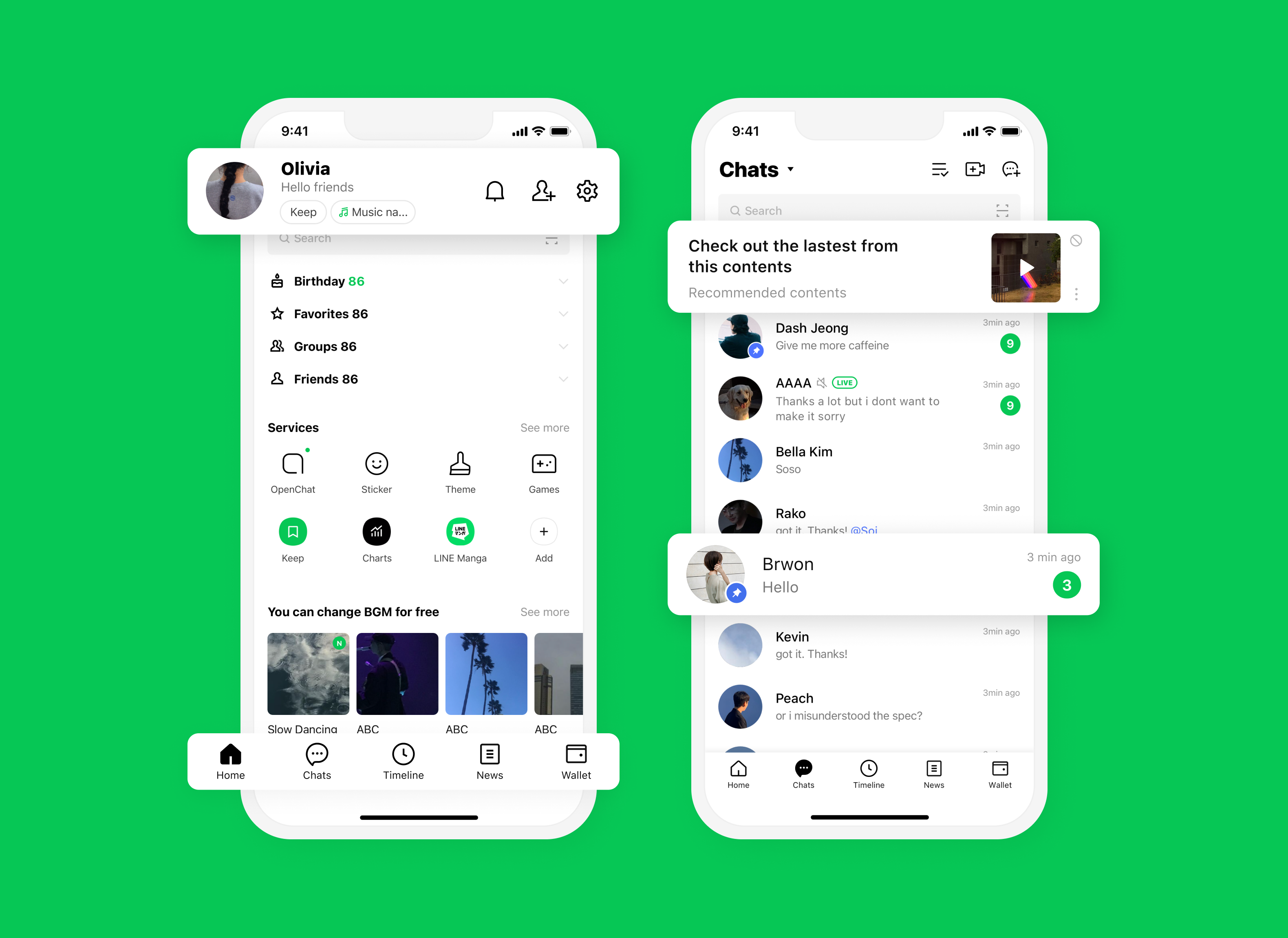
34 services, all with a consistent user experience
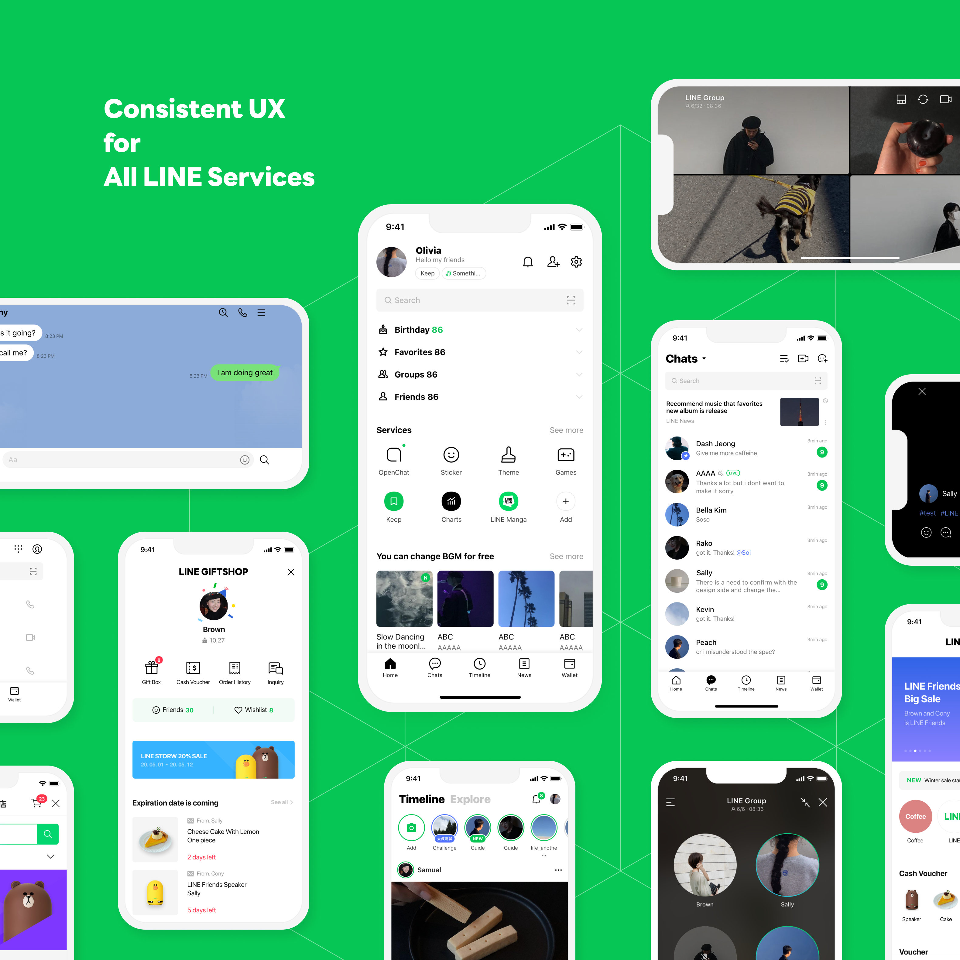
LINE operates 34 services around the world, such as LINE POINTS, LINE TAXI, and LINE Bank. That's why it is important we provide a design framework that is flexible enough for our global family of services, since each service has a different and independent business strategy of its own.
The LINE Design System is divided into two general categories: LINE Design System for Messenger (LDSM) for design concepts related to the messenger app, and LINE Design System for Global Family Services (LDSG) for our network of other services.
LDSM focuses on creating a unified design language with Foundation and UI Component, which serve as the basis of LINE design. LDSG aims to provide guidelines for a consistent user experience across our family of services. By focusing on web technology, LDSG allows designers in each country and the LINE Design System team to work together with flexibility while still adhering to the basic principles of LINE design.
LINE Design Foundation
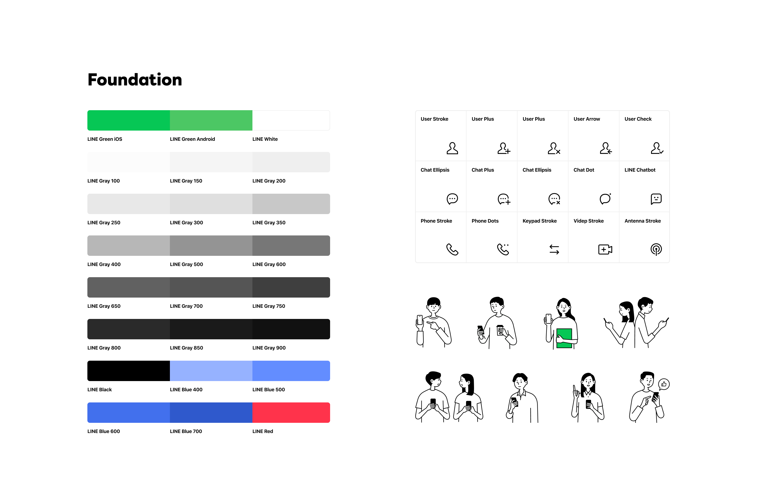
For the LINE Design Foundation, we provide the key design characteristics — such as standardized colors, icons, and graphics — necessary to create a consistent brand experience.
Previously, before we created this design system, unclear color guides led to different color usage by designers. But now we have an official shade of green, Forest Green, designated as the company's identity color, along with 30 related "core" colors that best match Forest Green and that can be used together. The core colors are the main colors of LINE design and are maintained with much specificity. Designers should almost never use alternative colors instead of the core colors, and doing so during product development can earn them an official warning.
To ensure a consistent design language, an icon library was built providing more than 200 icons in SVG and AI formats, and a guide for pictograms for service descriptions and functional descriptions. We also provide a guide for designing faces (such as expressions and ratios), figures, etc., for use within LINE app so that designers in each country can produce content with a consistent tone and manner. The guide offers lots of illustrations and a bright and friendly style so that people can enjoy it and find it accessible, whatever their age and wherever they are from.
Centralizing components and development guidelines for maximum convenience
The LINE Design System aims to simplify the entire design process, including finding components, utilizing guides, applying them and delivering development guides.
Each component page leads directly to a resource page on Figma, and designers can learn how to use components through examples of their structure, type, and usage (although the Design Library, downloadable resources, and development components are not open to the public due to security issues). Each component comes with a development guide so it can be deployed without requiring redundant communications between engineers and designers.
Product designers can contact the LINE Design System team to check whether their components are being used properly and according to the guidelines, or if they want to request adding new specifications and design types of components.
Although components were initially designed and provided based on the principles of the LINE design system, we will continue to develop and update them as needed. Therefore the continuous communication process is critical.
Check out the design system in use
Case studies allow designers to see areas where the components have been applied, along with the latest designs in use at LINE. Through this process, product designers can explore not only their services but also the overall direction of LINE design, examining the results of how various components look when applied and flexibly applying them to their products.
In the future, we are going to upload examples of LINE design in action in our various services, along with articles explaining the thought process behind those choices by the product designers.
What's next for LINE Design System?
Going forward, we will develop LINE Design System into a system for all that encompasses all aspects of planning and development by creating interactive design guidelines, providing more web components, and updating the design system applications. Please be sure to check it out!


