
How the LINE messenger became the 'Life on LINE' platform
Since starting in 2011 as a messaging app, LINE today has become a total lifestyle platform, with a whole family of services available for every part of our users' lives: hence the slogan "Life on LINE." We aim to meet our users' every need by offering them services they can use all day long, from when they get up in the morning to when they go to bed at night.
However, a side effect of being so complete was that we caused an overload of information in the LINE app tabs: Home, Chat, News, and Wallet. Too many services and contents meant the LINE app kept getting heavier, making it distracting and causing readability and usability to suffer. In fact, a survey from five countries (Japan, Thailand, Taiwan, Indonesia, and Korea) showed that our users believed the LINE app had become too complicated.
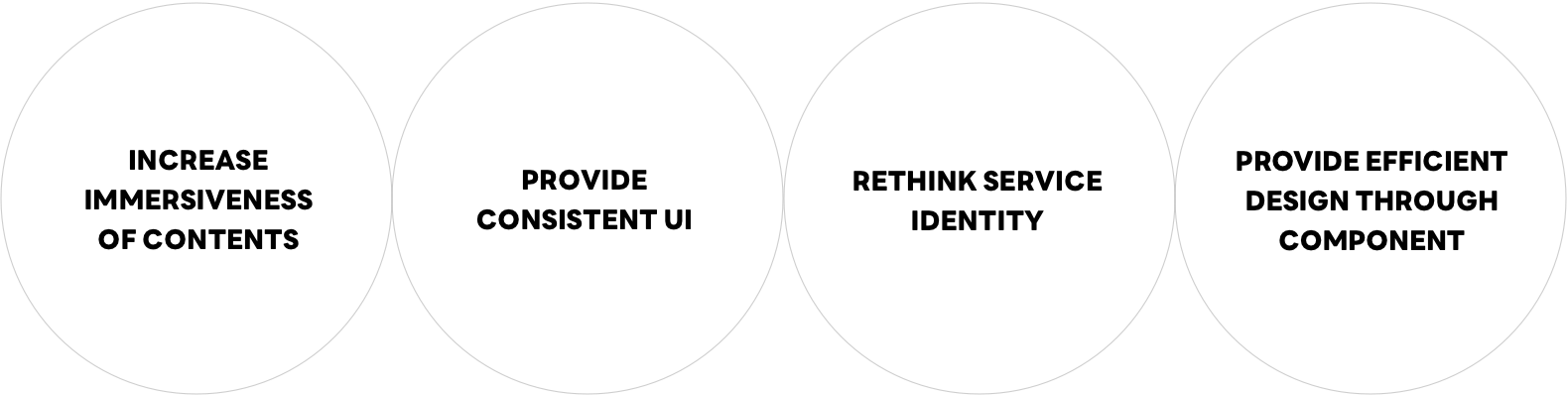
And so we decided that the time had come to redesign the LINE app, in a project we called "LINE New Design." We wanted simpler colors and fonts to improve readabilty and visibility of the contents. But more than just the look of LINE, we also wanted to boost usability and unify our UI components, using a process we call LINE Design System (LDS).
Over 3 years and 200 design tests in preparation
Each new function added to the LINE app over the years caused a few minor changes to its design, but for the most part the app was unchanged since launching in 2011, with the same navy blue bar on the top. This was the first time we decided to change the look and feel of entire screens.
The product designers in charge of LINE app design didn't just simply start making changes to LINE's appearance. This was a major project they've been working on for about three years. Throughout that time, they kept trying out new ideas and testing them, producing more than 200 test designs. Some were realistic, others were more experimental. Take a look as some of the test screens below and you can get an idea of how much work and research our designers put into the process. 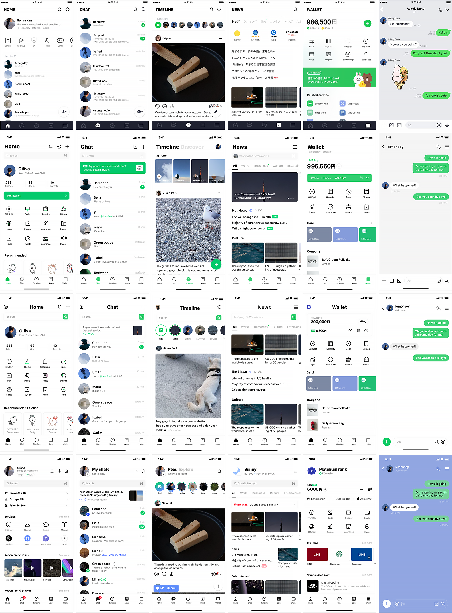
Simple, Wide and Bright
After three years of testing and experimenting, we were finally getting close, then in February we were ready to take the "LINE New Design" project to the next level.
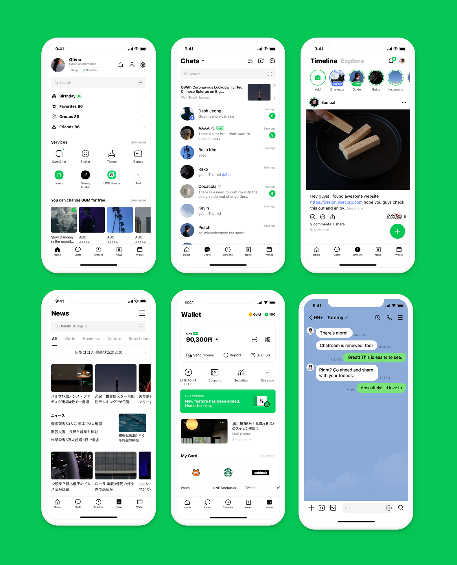
One of our biggest decisions was to remove the navy blue header, changing instead to all white to make the screens look bigger and lighter. Similarly, in the chatrooms we extended the blue background to the header area so that it gave the whole screen a greater sense of openness.
Creating a new design identity
Let's take a look at how the main design components – like color, fonts and icons – have changed.
Color
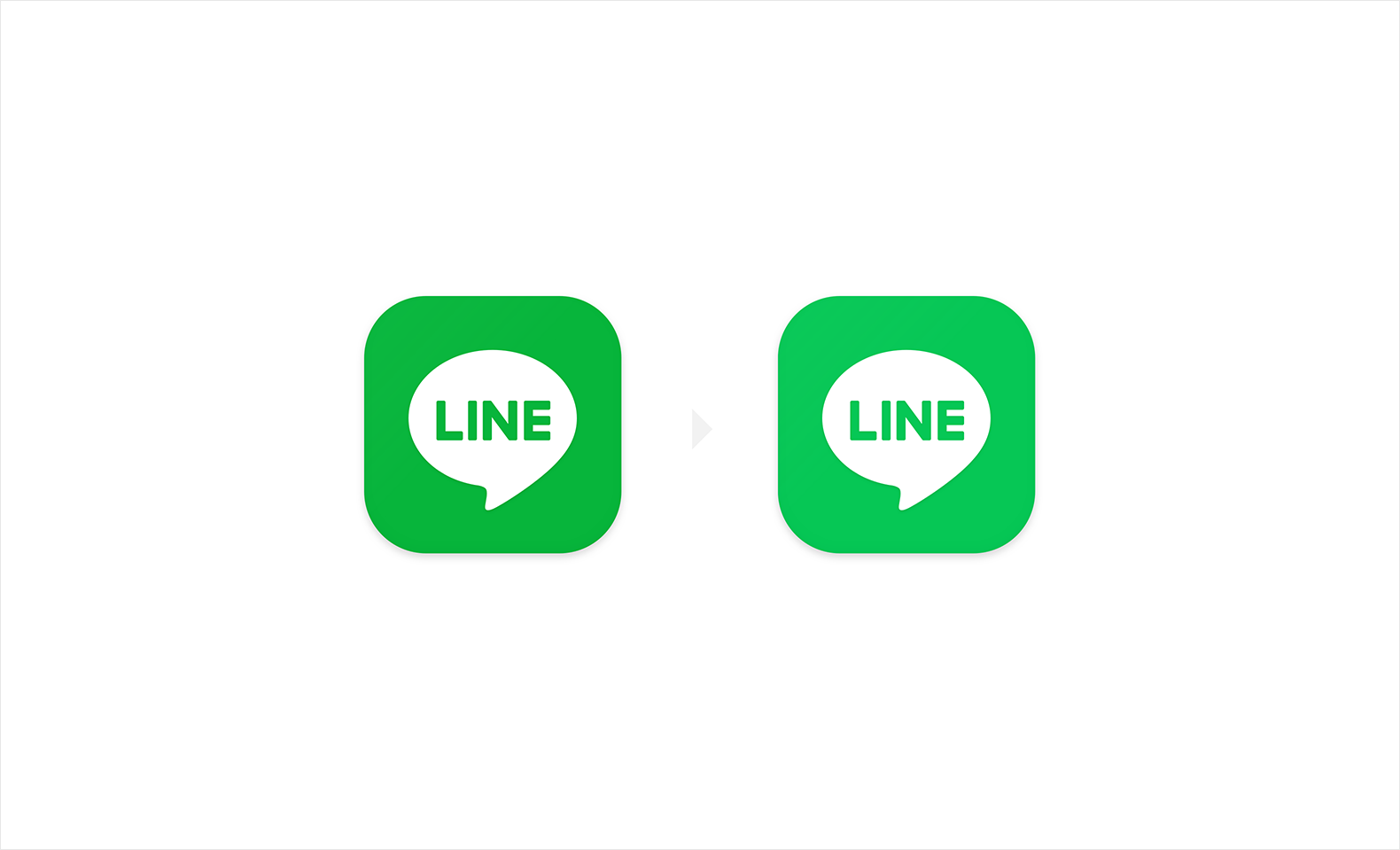
With the navy header replaced by white, the importance of LINE's signature green color has increased. Previously, we had modified the green we use from the original tone to a shade that better matched the navy; but, with the navy header gone, we were able to go back to the original "LINE Green" color.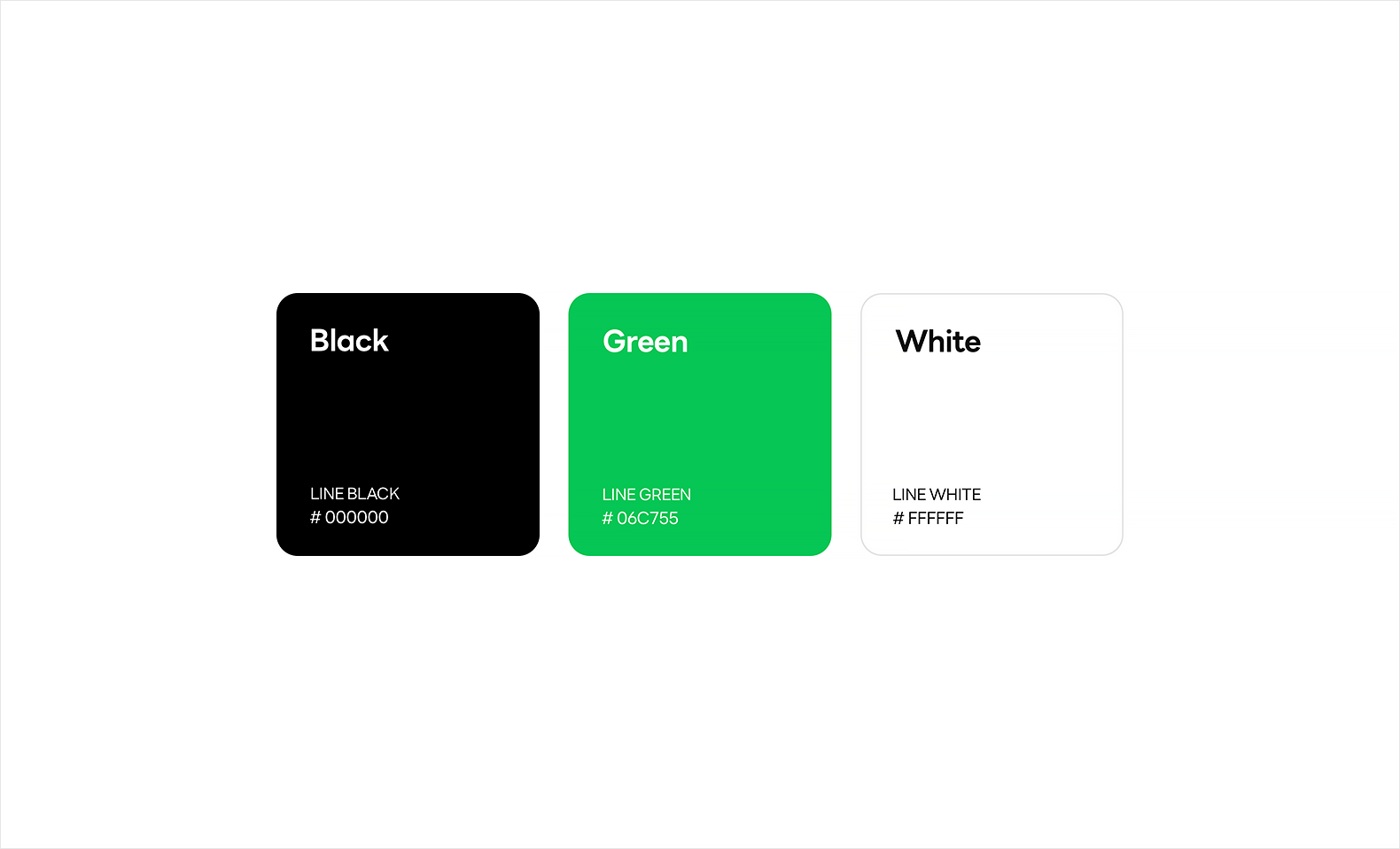
Icons
In the past, the icons on each tab and inside each area within the tabs had used many different styles. But, now, we've applied unified style, color and stroke-width rules, so they finally look consistent.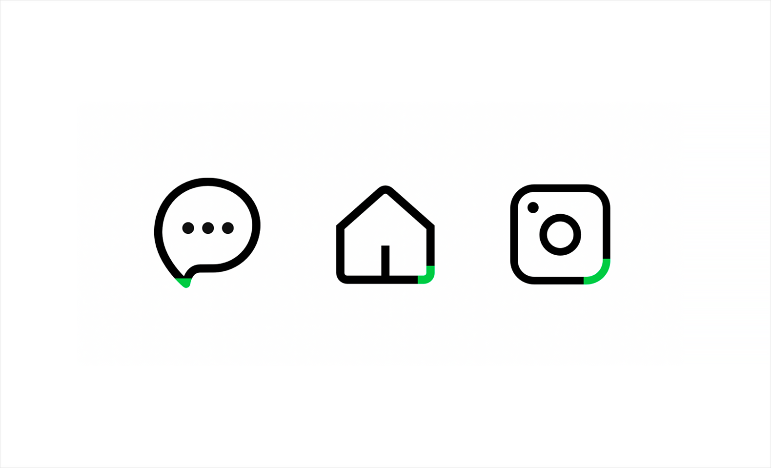
Fonts
By re-balancing the fonts and prioritizing content clarity, we were able to improve the LINE app's readability and comprehensibility. 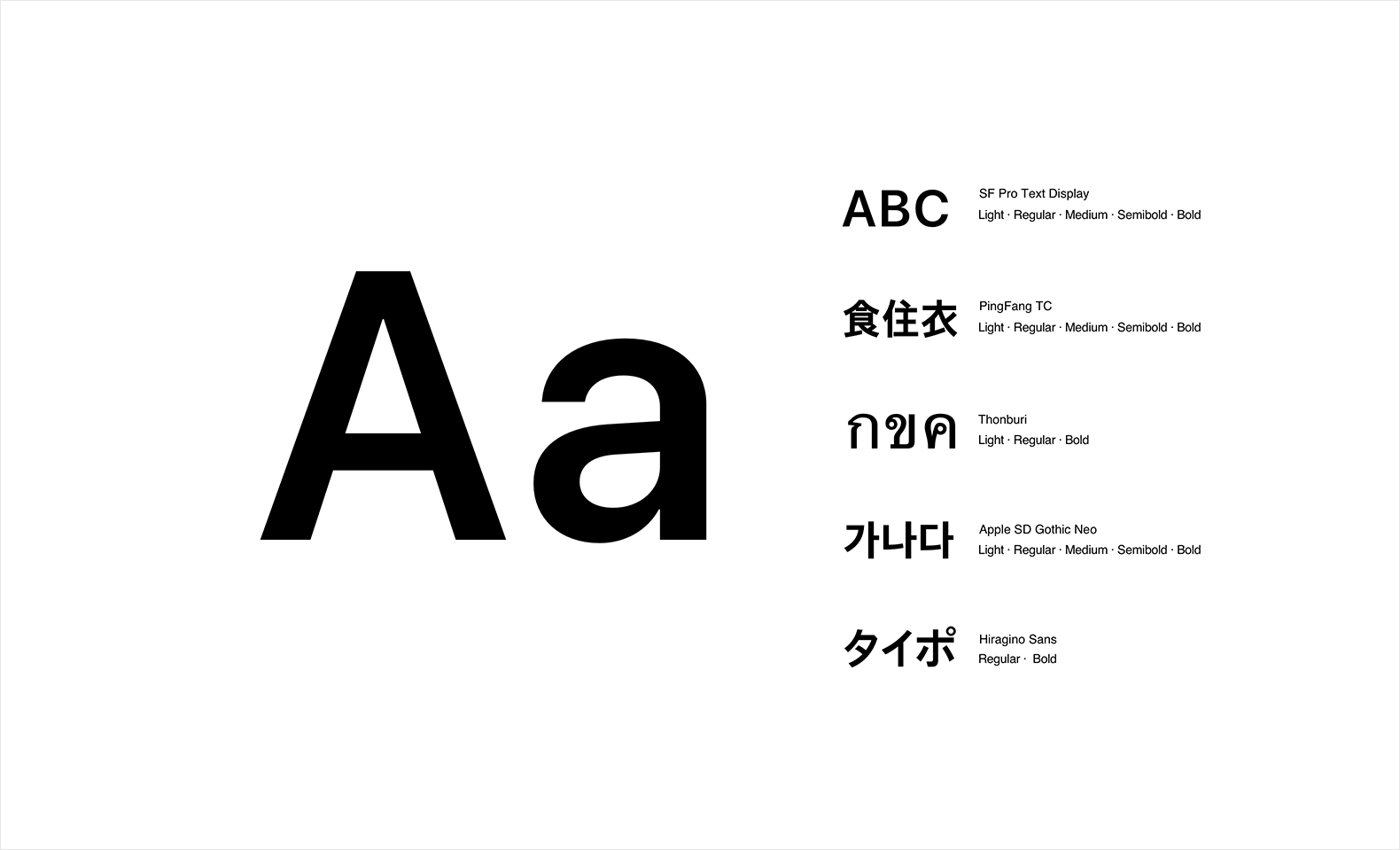
Margins
Margin rules were standardized and applied to the different contents.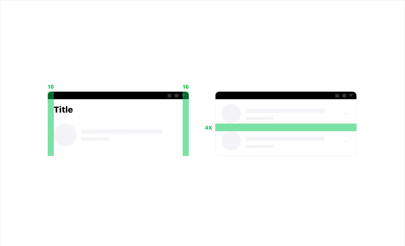
Templates
Templates were made for common components, like List, Thumbnail, Tooltip, Banner, Profile image, Popup, Button, and Story ring.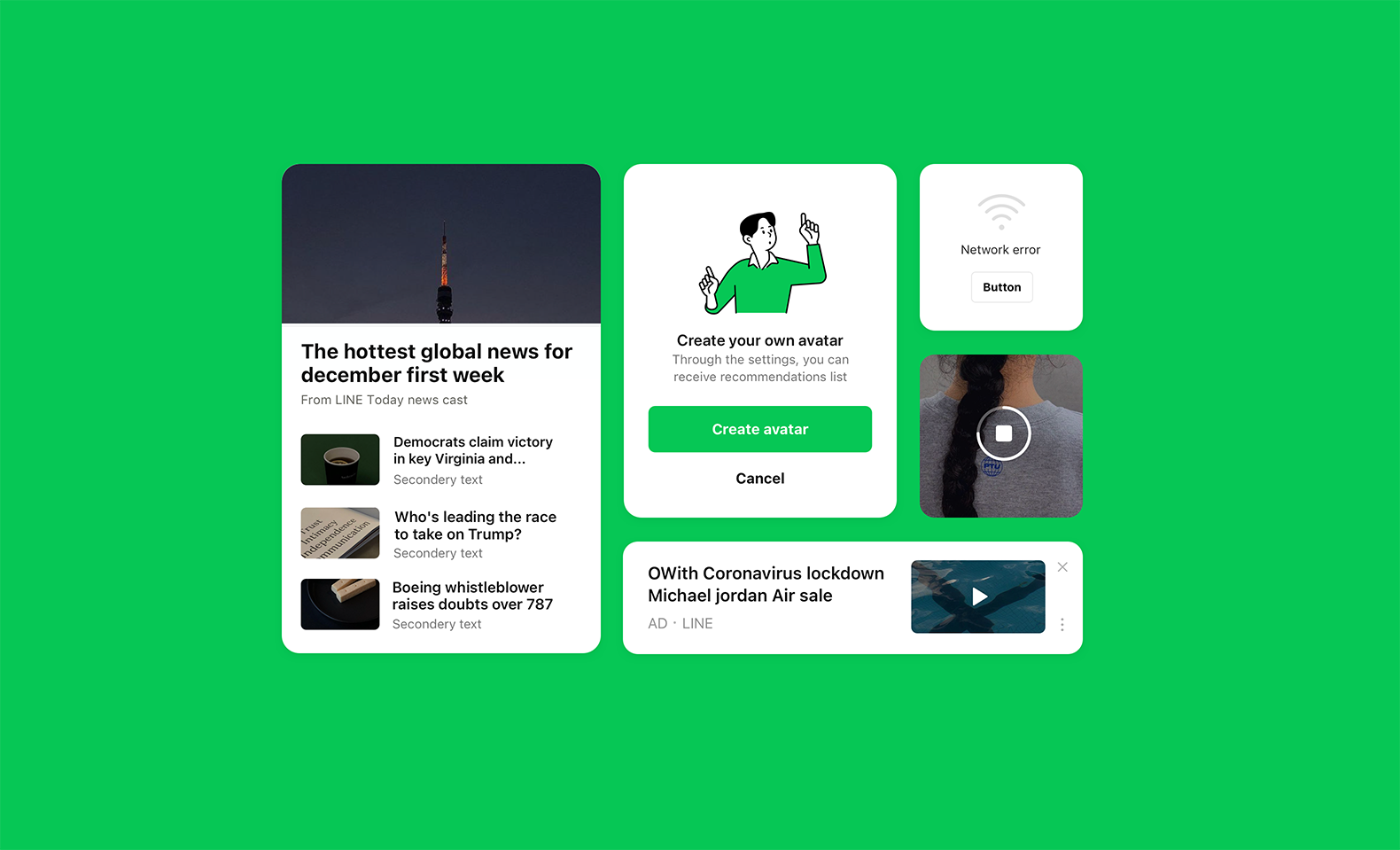
Everything grounded in user feedback
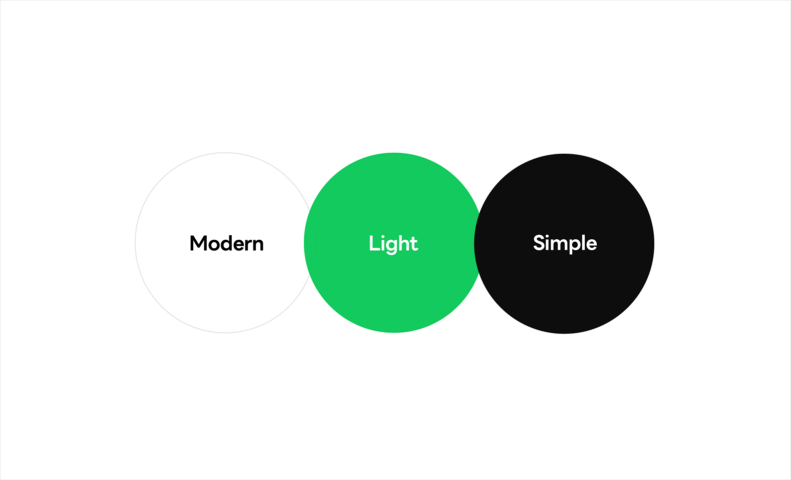
As we worked on the new design, we conducted two rounds of research on our users' opinions — once before development and again just before the release — consulting with 300 users from Japan, Thailand, Taiwan, Indonesia, and Korea. We showed them the prototypes of LINE New Design and asked for their opinions. As a result, we found the three most representative keywords.
'Modern' 'Light' 'Simple'
Users who participated in the survey responded that the new LINE looks simpler and more sophisticated than before, as well as wider because of the white background. One user said, "I feel like a stuffy ceiling disappeared since the navigation on the top has gone." Others said that it was easier to see both the images and texts than before. From the results of these surveys, we could see that we successfully achieved our New Design goals.
The future of LINE app design
Since LINE is such a large platform, we have many more screens underneath the major screens. Realistically it is not possible to change every component on every screen at once. So, we chose to apply the new design first to the major screens in the December 2020 release — however, going forward, expect these new design principles to be applied to more and more screens!


